 0
0
 0
0
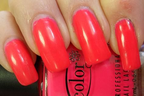
Do not adjust your screens. This really is an in-your-face neon shade. Last night I went rummaging around the stash as I had a craving for a hot pink creme colour. I knew maybe I should have headed straight for the OPI box,  but this caught my eye.
Warhol came as part of the Color Club Poptastic collection that came out for Spring last year. The collection found its way to me via Kae over at The Hungry Asian, who hosted a contest last year that I won! Yippee! However, the shades were so bright that it’s taken me a while to get up the nerve to wear them. And like I say, in the dim light of my spare room last night, I thought this was an average pink creme. Ha!
Like many neons, Warhol was a bit of a devil to apply. Lovely consistency and brush but I founf the colour to be verging on the sheer side, this was eventually opaque enough for me to cope with it after about five coats. I expect it would work well over a white or nude shade, but like I say, I didn’t know it was neon til I stepped out of my house this morning so just put it down to being a sheer polish.
Imagine my surprise! It’s hot! What a shade! Not for the faint of heart, Warhol is a shockingly powerful pink/orange neon. Like coral went radioactive.
I really enjoyed wearing this in January, as it was a lovely contrast to all of the berry and dark shades I’ve been sporting. And it garnered lots of compliments from all kinds of people – shop assistants, colleagues and even the receptionist at the dentist.
 So there we have it. I did neon. And liked it. I’ve come a long way since starting this blog.
On a darker (much darker) note, I went to see Black Swan at the weekend. Have you seen it yet? It’s the stuff of nightmares for a nail blogger, but I haven’t been able to stop thinking about it ever since. Have you seen it? I’d love to hear your thoughts.
Helen


I’m not at all a fan of pinks, but I love Warhol. I love the almost-orange glow it has.
[…] This post was mentioned on Twitter by Helen , Helen . Helen said: Today's post: @ColorClubNail Warhol http://www.just-nice-things.co.uk/?p=11812 […]
I may go and see Swan. I like a good scare. I thought it was just a ballet pic. I gather there’s more to it than that…
Warhol? Suits you.
omg..I love it! it’s such a vibrant shade…not sure my nails are in good enough nick to wear it but would easily wear on toes…
Firstly, I love that the collection is called Poptastic, such a sugary sweet name for a sugary sweet colour. the second point refers to the first in that the colour is LOVELY.
That is a bright shade! Pretty but shame you had to use so many coats. I haven’t seen the
Black Swan yet. I’ll wait till it’s out on DVD. I can’t stand people in the movies. I always get people around me that talk or kick my chair.
[…] Poptastic collection from last Spring. Remember last month, when I showed you the fantastic Warhol? Well, this is from the same collection. Pucci-licious doesn’t quite run to neon, like many […]